 +91-9540344454
 Use of Tables, Graphs or Charts in a PPT is vital
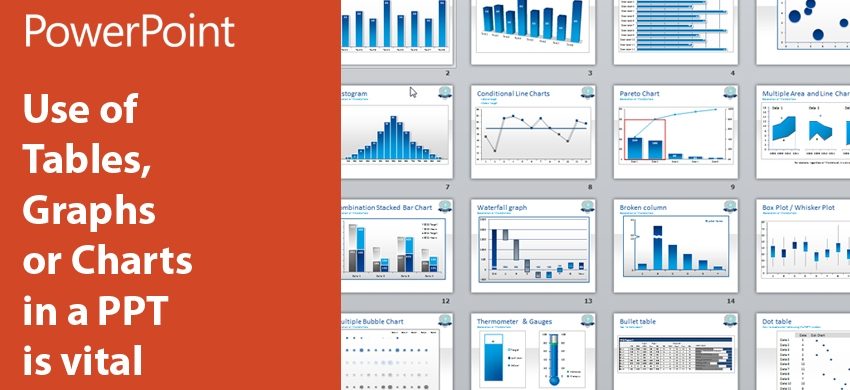
Over the years, graphs, charts or tables have an increasing presence in PPTs. The moment the story comes to numbers, we try to bring in varied graphs or tables to convey them to audiences in an emphatic style. Designers and creative thinkers zero in on their specific types of the many available to aptly gel them with other contents of the presentation.
While every graphical depiction of data simplifies facts and figures, the real reason to use them should be the base-point of selection of the type. A definite rationale must lead you to a specific graph for your PPT. Area-based graph depicts the correlation of different ingredients against a big entity over the time like your company’s over-all profit versus revenues coming through your products or services over a fixed period. While the column-based graph explains the variations in individual value up and down, the Bar-based graph illustrates the variations in these values horizontally. Pie-chart or graph carries proportion-wise distribution of something and the Line- graph comprehensibly presents data of something at different stages in time. A Pie-graph doesn’t show the exact value of the data and so, you have to be very careful to pick this visual tool for your PPT.
An arrangement on a set of columns and rows, a table is usually not that helpful in presenting data as a graph because it only contains the data, but a graph carries the elucidation on the data as well. Your target-audiences would definitely find comfort in comprehending graphs. If by any means, you assimilate table in your PPT, make sure to attach it with the explanation of its data as well!
Any graph, chart or table is incorporated in a PPT to make things clearer for audiences and so, choosing the right type is very significant. Also, the data you think are the integral ingredients with respect to the core message of your PPT must be highlighted by you through appropriate methods.