 +91-9540344454
 6 clear benefits of Graphs, Charts or Tables in a PPT
When you back up your facts and figures with appropriate and corresponding graphs, charts or tables in a PPT, the information presented by you becomes stronger and impactful. Apart from carrying a great visual appeal, these graphs, charts or tables impart relevant business information to your target audiences in an arranged manner. Your core message gets boosted surely by these visual illustrations.
Another reason why people prefer to have graphs/bar/charts and numbers
1. The numbers feel valuable
2. The graphs / stats feels safe
3. Tables, Numbers etc give the feeling of a well-researched proposal
Impact of bar, graph & chart in PowerPoint Presentation
We can derive many benefits of delivering data in different graphs, charts or tables in a PPT:
- Graphs, charts, pictorial diagrams or tables present information in a concise, consistent and compact style. Target-audiences grasp the meaning of the data quickly.
- Graphs, charts, pictorial diagrams or tables are visually more engaging than a plain textual content. And your PPT automatically becomes more engaging with their rightful assimilations.
- Audiences always want to draw some conclusions from the slides bearing them which is always good to understand the core conclusion of the presentation.
- Making assessment of facts becomes easier for audiences as these visual modes allow them to compare different data and numbers.
- More can be said, more facts can be accommodated and arranged in a terse manner and that is the beauty of graphs, charts, pictorial diagrams or tables in a PPT.
- They help your prospective clients make important inferences on different finer aspects of your business on different comprehensible parameters.
Graphs, charts, pictorial diagrams or tables present information in a concise, consistent and compact style
Target audiences grasp the meaning of the data quickly when shown visually. The main aim of any PPT is to showcase information in a visual format. Ideally, there should be minimum text and more images, icons or graphs.
Images are 80 times faster to understand and impressive in nature.
Check out the following image and see which one you understand first 1 or 2 ?
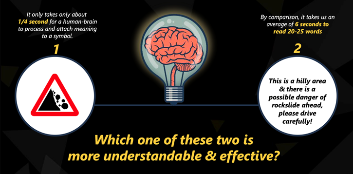
It only takes about ¼ second for a human brain to process & attaches meaning to a symbol. See more information on Prezi
Using images, vector and bar graphs are a huge advantage that you won’t want to miss in your PowerPoint presentation.
All professional presentation designing companies, know the secret and always provide you with the presentation with meaningful images.
Graphs, charts, pictorial diagrams or tables are visually more engaging than plain textual content
We all have attended bore meetings with too much information, a speaker talking about a load of information and very soon everyone looks for an escape and your PPT automatically becomes more engaging with their rightful assimilations.
You can quickly figure out this by seeing people looking at their mobile phones, talking to each other or simply moving out.
To ensure audience interest it is important to present engaging information. There is nothing more interesting than images, diagrams or graphs. Try adding as many as you can, preferably where information in the presentation gets boring or complicated.
There is no harm even adding few image slides as separator slides just to break the monotony
What Kind of bar, graphs are suitable for my presentation?
The answer to this question is hidden in the information that you are about to present and the understanding level of the target audience. At Recherche when the client presents us their content for making a presentation, we always transfer data into the easier format of understanding i.e graphs, tables, charts, bars etc.
If you are trying your hands-on presentation designing yourself then there is an easier way of converting your data into graphs by using excel.
Simply paste your data into an excel file to give proper marking and excel will give you multiple graphs. You can select the format of the graph by yourself in excel.
Select type of graphs for PowerPoint, imported from excel
- Column
- Pie
- Tree-map
- Sunburst
- Combo
- Gantt chart
- Bar chart
- Line chart
- Area diagram
- Waterfall diagram
- Scatter diagram
- Mekko diagram
Few benefits of having bars, graphs, charts and images in PPT are as follows:
· Audiences always want to draw some conclusions from the slides bearing them which is always good to understand the core conclusion of the presentation.
· Making an assessment of facts becomes easier for audiences as these visual modes allow them to compare different data and numbers.
· More can be said, more facts can be accommodated and arranged in a terse manner and that is the beauty of graphs, charts, pictorial diagrams or tables in a PPT.
· They help your prospective clients make important inferences on different finer aspects of your business on different comprehensible parameters.
While they are potent tools to enhance the overall impact of your PPT, graphs, charts or tables can spoil your presentation also if they have not been prepared or placed appropriately. Premeditated assimilation can bewilder your target audiences as well.
As always if you need a professional presentation design service or have data that needs to be converted into bars, graphs, and tables, simply follow the link
For free PowerPoint templates of presentation, follow the link where you can simply put your information and quickly design PowerPoint by yourself